The UX Laws You Should Be Aware Of (Part 1) — Epicpxls Tutorial
Here are the UX laws that every designer needs to know, including examples from real-life products.


When people hear the word “design”, they may be inclined to think of a solely creative role in which a person is tasked with creating something beautiful. But UX design recognizes that aesthetically pleasing designs don’t necessarily make for a more usable interface.
What lies beneath a successful experience is the careful attention paid to understanding how the user will think, perceive, and act as they move through their journey.
For a deeper understanding of what causes users to do what they do, UX designs often rely on a collection of widely known psychology laws, or standards, that help determine their design choices.
I’ll be taking you through some of these laws and their proper applications in this tutorial series.

1. Hick’s Law
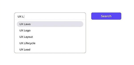
“More options, more problems.”
Did you know that having more options isn’t always better?

Users bombarded with choices have to take time to interpret and decide.
Hick’s law describes the time it takes for a person to make a decision as a result of the possible

The more choices you present your users with, the longer it will take them to reach a decision.
How to apply Hick’s Law in UX design:
- Categorize and highlight options.
Enabling users to find items from higher categories, as if they were looking under sections in a library.

- Minimize choices; focus on where and when to place the choice.
Just like how Instagram gives users a simple choice to double-tap to place a like. - Obscure Complexity.
Breaking up long or complex processes into screens with fewer options.
An example can be the purchase options on Amazon.

Instead of showing everything all at once in the payment process, break them down to two options for the user to choose either a one-time purchase or regular subscribes before adding the item to the cart.
When NOT to use Hick’s law?
If decisions are complex and require extensive reading, researching, or extended deliberation. Hick’s law won’t be able to predict the time to make a decision.
Takeaways
- Simplify choices for the user by breaking down complex tasks into smaller steps.
- Avoid overwhelming users by highlighting recommended options.
- Don’t oversimplify.
2. Parkinson’s UX Law
“Any task will inflate until all of the available time is spent”
The more time you give to a task, the more complex and daunting it will become so as to fill this time.
Things to learn:
- Save users’ time while completing a task by automating the process.
- Reduce time and effort while matching the user’s actions and saving energy.
It will be a great aid for users to save time and get the content faster by implementing autofill.
Takeaways
- If your design can’t speed up the process, it won’t last longer. The quick-paced world needs things at its tips.
- Reducing the actual duration to complete a task from the expected duration will improve the overall user experience.
3. Jakob’s Law
“Similar But It’s Not The Same”


Shopee mobile app UI & Lazada web UI

Look, most E-commerce sites place the search bar on the very top of the site.
This is when Jakob’s Law comes in.
“Users spend most of their time in other sites. This means that users prefer your site to work the same way as all the other sites they already know.” — Jakob Nielsen
By making your design predictable, you minimize the user’s cognitive load when they use your product.
Avoid reinventing the wheel.
Creating unfamiliar experiences might confuse the user or make people feel frustrated and likely to leave your platform.
Familiarity helps the user focus on their tasks rather than on learning new models.
However, it’s okay to deviate from standards when it created better experiences. It’s all about CONTEXT.

Take the iOS country picker as an example. For the case of a selection from very few items, this pattern provides good usability. But it pains when selecting from the long list of countries.
Takeaway
Patterns are just starting points, the real work begins when designers innovate on existing patterns to build an optimized experience for your user.
4. Miller’s Law
“Less is more.”
Have you ever heard of the term Magic Number Seven?

When people are asked to glance at a list of objects in a short-term memory test, most people will remember between 5–9 items.
In 1956, George Miller asserted that the span of immediate memory and absolute judgment were both limited to around 7 pieces of information. This means that the average person can only keep 7 (plus or minus 2) items in their working memory.
How to apply Miller’s Law
Organize content into smaller chunks to help users process, understand, and memorize easily.

Slack uses this rule to chunk users’ information into relevant groups in their sign-up journey. Each page asks for only a handful of things to reduce the cognitive load on the user.

Humans can only hold about seven pieces of information in their memory at a time. More than that and they could be overwhelmed.
5. Fitt’s Law
The time required to acquire a target is a function of the distance to and size of the target.

The longer the distance and the smaller the target’s size, the longer it takes to acquire the target.
How can we implement this in our design?
- Touch targets should be large enough for users to accurately select them.

2. Touch targets should have ample spacing between them.

3. Touch targets should be placed in areas of an interface that allow them to be easily acquired.

Touch target for easy accessibility

Making the primary CTA button closer to the thumbs makes it easier and quicker for the users to perform that action.

Takeaways
- A larger target is easier to click.
- Add sufficient spacing between buttons.
- Place related targets close to each other.


Did you enjoy this article? Let us know what you think in the comment section below!
If you are searching for designs like fonts, icons, UI Kits, animations, graphics, illustrations, themes, photoshop add-ons, and templates, Epicpxls has a lot to share with you from free to premium design materials/resources.
Sign up for our Weekly Newsletter to be updated on our weekly blog and weekly surprises! You can also follow us on Facebook, Twitter, and Instagram.
Part 2 is coming up next! 🎁
Hit the “follow” button to be updated on the next parts of this Epicpxls tutorial series.