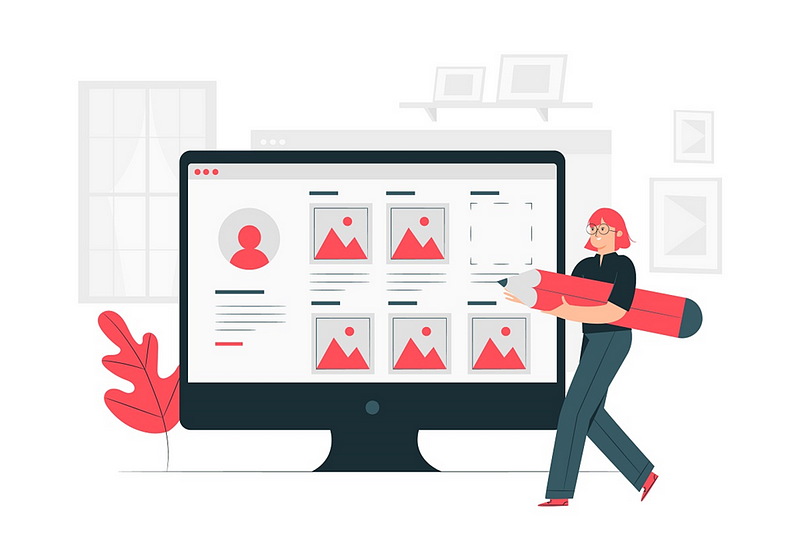
How to Use Icons to Create the Perfect Portfolio
Creating a good portfolio may become a stumbling block on the road to success. With so many options to sort through, you might be confused…


Creating a good portfolio may become a stumbling block on the road to success. With so many options to sort through, you might be confused about where to begin. That is where icons come in. They are easy-to-use visual representations of your work that can help you showcase your skills and abilities in an easy-to-understand way. Discover how to create the perfect portfolio using icons and make it look professional and attractive.
Having a good portfolio is important for your career. If you want to build a successful portfolio, you should pay close attention to each detail in it, including icons. Icons are an effective way to stand out and demonstrate your skills and knowledge in a visually appealing way. They can help you connect with potential employers, and make it easier for them to understand what you are capable of.
What Are Icons?
Icons are small images that appear on the top right corner of websites and applications to indicate which parts of the site or application are available for users. They help users quickly identify important areas of a website and make it easier for them to find what they are looking for.
What Are Icons Used For?
When you use an icon in your web design, you link it to a specific concept or function within your site. It makes it easy for users who know about that concept or function to quickly locate it on your page. Icons are always displayed properly in all types of browsers, no matter how old they are.
How to Use Icons in Your Portfolio
Creating a portfolio using icons is an effective way to make your work stand out and communicate your message effectively. Here are the steps for creating an ideal portfolio using icons:
1. Decide the Purpose of Your Portfolio
When creating your portfolio, decide what type of audience you want to reach and focus on providing information relevant to that audience. For example, if you create a personal website for use at job interviews or networking events, make sure all content is targeted toward people who hold positions of authority within those industries. To ensure that your content is error-free, visit writing service websites such as Best Essays Education.
2. Choose a Style
There are many styles available when it comes to iconography, from traditional illustrations and vector artwork to modern flat designs and textures. As long as the iconography looks professional and fits with the overall look and feel of your project(s), go ahead and choose whatever style works best for you.
3. Choose an Iconic Image
Once you have decided on a style, you should find an icon that perfectly represents what you want to illustrate in your portfolio. Do some research online or consult with colleagues to get recommendations.
4. Edit/Design/Customize Until Satisfied
After you have selected your icon and edited it to your liking, you are ready to start customizing the layout of your portfolio pages. You can add text or images alongside the icon, design individual pages for each project, and set up galleries for displaying a variety of different icons in one place. If you are unsure about the quality of your content and need professional assistance, contact the writing service professionals at Trust My Paper.
5. Share & Promote
Once you have created your portfolio using icons, be sure to share it on social media platforms and other websites where potential clients/employers may be searching.
Tips for Using Icons in Your Portfolio

Icons provide a concise way to communicate your ideas while still looking professional. They can also help you stand out from the crowd, making it easier for potential clients or employers to find you.
Check out Epicpxls’ library of free and premium design components if you need a charge of inspiration and some new design templates such as animations, icons, graphics, fonts, etc.
There are several ways to use icons in your portfolio. You can use them as part of headings and subheadings, within paragraphs and lists, or even as standalone images. Here are some tips on how to create effective icon designs:
Tip 1
Start by thinking about what message you want to communicate with your icon designs. Is it positive? Negative? Professional? Urgent? Once you have a clear idea of what you want, you can begin brainstorming different options for icons that fit that theme.
Tip 2
Make sure each icon is distinctive yet easily recognizable. It is helpful if each icon has its unique tone and style so that it stands out from the rest of your portfolio without being overbearing or distracting.
Tip 3
Choose high-quality graphics suitable for print publication (300 DPI at least). It will ensure that your icons look crisp and clean when used in electronic formats. For example, PDFs or websites.
Tip 4
Once all of the icons are designed, you should ensure they are ready for usage by adding keywords/tags/annotations wherever necessary. It will help readers find the specific image they are looking for more quickly and increase clickthrough rates on your portfolio images.
Tip 5
Make sure to use the correct file type for each icon when uploading it to your website or portfolio. For example, GIFs should be used for icons that are meant to be displayed as small graphics on a web page, while JPGs should be used for larger icons with a more impactful design.
Tip 6
Use icons that represent the kind of work you do. For example, if you are a graphic designer, use icons related to graphic design.
Tip 7
Use icons that are recognizable and easy to understand. Try to use an icon for every type of work you do, so people can easily see which skills you have. Make sure your icons are properly sized and positioned.
Tip 8
Try to use different types of icons (vector illustrations, photographs, etc.) to add variety and depth to your portfolio.
Tip 9
Keep your icons updated and fresh. People will be more likely to view a portfolio that is well-made and up-to-date.
Tip 10
Use icons sparingly. Too many icons will make your portfolio difficult to navigate. Remember that people will not always be able to see your icons, so use descriptive text instead if necessary. Consistently display your icons throughout your portfolio: use the same sizes, colors, and placements.
Conclusion
Icons can be a powerful tool to add more life and visual appeal to your portfolio. From now on, make sure you include them in your portfolio because they can help convey an instant vibe about your identity. As long as the icons are simple, attention-grabbing, and easy to use, you will be able to stand out from the crowd effortlessly.

Did you enjoy this article? Let us know what you think in the comment section below!
If you are searching for designs like fonts, icons, UI Kits, animations, graphics, illustrations, themes, photoshop add-ons, and templates, Epicpxls has a lot to share with you from free to premium design materials/resources.
Sign up for our Weekly Newsletter to be updated on our weekly blog and weekly surprises! You can also follow us on Facebook, Twitter, and Instagram.