Design Like A Pro: Tips to Master Clean Design
Master the art of clean design. Elevate your creations and captivate your audience with these tips!

Master the art of clean design with grayscale, minimal colors, high-quality fonts, and strategic layouts. Elevate your creations and captivate your audience with these tips!
Tip 1: Begin with Grayscale
To create clean designs, start with a simple yet effective strategy: work in black and gray. By doing so, you can concentrate on addressing the design problem without getting distracted by colors. Once you have established a solid foundation, you can then experiment with various color schemes to enhance the overall look and feel of your design. Grayscale helps focus on content more before beautifying it!

Tip 2: Restrain Your Color Palette
When it comes to selecting colors for your interface, less is often more. To prevent overwhelming your design with an excessive number of hues, consider adhering to the 60–30–10 rule or employing neutral shades of your primary accent. This approach will help ensure that your design looks clean and professional, rather than resembling a gaudy holiday decoration. Remember, simplicity is usually the best policy when it comes to color selection.

Tip 3: Soften Your Shadows
Shadows can be a useful design element, but they are also frequently overused. In some cases, it may be best to avoid them altogether. If your brand permits the use of shadows, try using softer shadows instead. To achieve a more subtle effect, consider utilizing the following standard shadow settings.

Tip 4: Opt for High-Quality Fonts
Choosing the right fonts can have a significant impact on your design’s overall appearance. It is crucial to select sleek display fonts and legible body fonts that complement your brand’s style and purpose. A well-chosen font can elevate your design and convey the intended message effectively. Therefore, invest time in researching and selecting high-quality fonts that enhance the overall look and feel of your design.

If you’re not sure whether to look for cool fonts, check these out: https://www.epicpxls.com/items/of/category/fonts
Tip 5: Embrace White Space
White space is a crucial element of clean design. Don’t hesitate to add extra space between your design elements. When in doubt, use an 8pt grid and leave at least 8–16px of space between your elements. If necessary, increase the space to create a more distinct visual hierarchy. Adequate white space enhances readability and helps to avoid clutter, resulting in a more professional and elegant design.

Tip 6: Enhance Your Images
Images can be a powerful visual tool when used appropriately. When combining images with text, ensure that you select high-quality images with enough contrast between the background and your foreground font color. This will make your text more readable and prevent it from blending in with the background. If necessary, you can add overlays on top of the images to create a better contrast or to direct attention to a specific area of the image. By taking the time to enhance your images, you can make your design more engaging and visually appealing.

Tip 7: Achieve Proper Balance
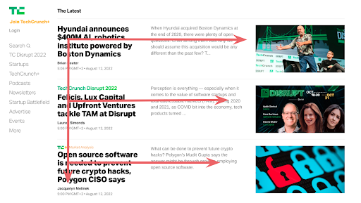
Achieving the right balance in your design is crucial for creating a clean and effective layout. Consider dividing your design into 3–4 (invisible) blocks, and placing your main calls-to-action (CTAs) in easily accessible areas, such as the thumb zone. Utilize imagery to attract the user’s attention and guide their eye through the design. When placing your remaining content, consider following either an F or Z pattern, as these are the most common eye-tracking patterns. By achieving the proper balance in your design, you can ensure that your content is easy to read and engage with, resulting in a more enjoyable user experience.

What is F and Z Pattern?
The F and Z patterns are common eye-tracking patterns that people tend to follow when scanning web pages or other types of designs.
The F pattern refers to the way people read content from left to right, top to bottom, creating a shape that resembles the letter “F”. People will typically scan the top of the page horizontally, then move down the page and scan shorter horizontal lines of text. Finally, they will scan the left side of the page in a vertical movement. This pattern is commonly used for text-heavy pages.


The Z pattern refers to a similar scanning pattern, but instead, the shape created resembles the letter “Z”. Users will start at the top left of the page and scan to the top right, then move diagonally to the bottom left, and finally to the bottom right. This pattern is typically used for designs that have a visual hierarchy, with different elements arranged in a specific order from most important to least important.

By understanding these eye-tracking patterns, designers can strategically place content and design elements to guide users through the design and ensure that they see the most important information first.

Did you enjoy this article? Let us know what you think in the comment section below!
Grab freebies from our website: Epicpxls, and sign up for our Weekly Newsletter to be updated on our weekly content!

