7 Best Practices for eLearning Platform Design
Discover the top 7 best practices for designing eLearning platforms that optimize user experience in a Learning Management System (LMS).

7 Best Practices for eLearning Platform Design in LMS User Experience
Are you considering upgrading your Learning Management System (LMS) to be at pace with the latest standards and best practices? In today’s digital era, eLearning has become integral to education and professional development.
As competition in this market grows, the best learning management system will be ones that have exceptional design, as this will play a crucial role in enabling better and more engaging experiences.
To help you create exceptional User Experiences (UX) for your LMS, we will explore the 7 best practices and unlock the secrets to designing a user-friendly, intuitive, and impactful eLearning platform.
What is LMS?
A Learning Management System (LMS) is a powerful software built to ensure that organizations can effectively manage, deliver, and track their online training and education programs.
With an LMS system, you can centralize your learning content, streamline the process of updating and adding new content, and streamline overall learning administration. Thus, learners can get the most up-to-date and relevant information while enhancing learning experiences using immersive elements like video, short-form content, quizzes, and more.

7 Best Practices for eLearning Platform Design in LMS User Experience
When it comes to the most efficient eLearning platforms, it is all about efficient design, as this ensures that users can easily navigate and engage with the information or tools they need to complete their coursework.
To help you design the best learning management system for your needs, here are 7 best practices that you can follow:
1. Maintain consistency in eLearning UX design
Consistency is critical when designing an eLearning platform. The platform should have a consistent color scheme, typography, and imagery that reflects your organization’s brand. This helps to create a sense of trust and familiarity among users.
Thus, when designing the platform, it is important to keep the brand’s guidelines in mind and ensure that the elements, such as colors, fonts, and imagery, are designed with the same outlook. This, in turn, builds credibility and trust among the learners.
2. Simplify and be direct
Be it eLearning content or design, the ideal approach is to get straight to the point. Avoid cluttered screens and unnecessary graphics or text. Instead, the focus has to be on the most important information on each page. If the user is presented with too much information, they may feel overwhelmed or confused.
Ensure the course content is presented in a way that is easy to understand and follow. This can be achieved by breaking the content into smaller segments and using clear headings and bullet points.
Using multimedia elements such as images and videos can also help reinforce the content and make it more engaging for the users, but only if it is used properly and with the right intent.
3. Developing e-learning content, sticking to the fundamentals
When developing eLearning content, knowing why the entire exercise is being conducted is important. This includes having clear course objectives and defined outcomes.

The content design can be aligned with the course objectives by sticking to the fundamentals. This includes using interactive content such as quizzes, games, videos, and simulations to help engage learners and make learning more enjoyable and effective.
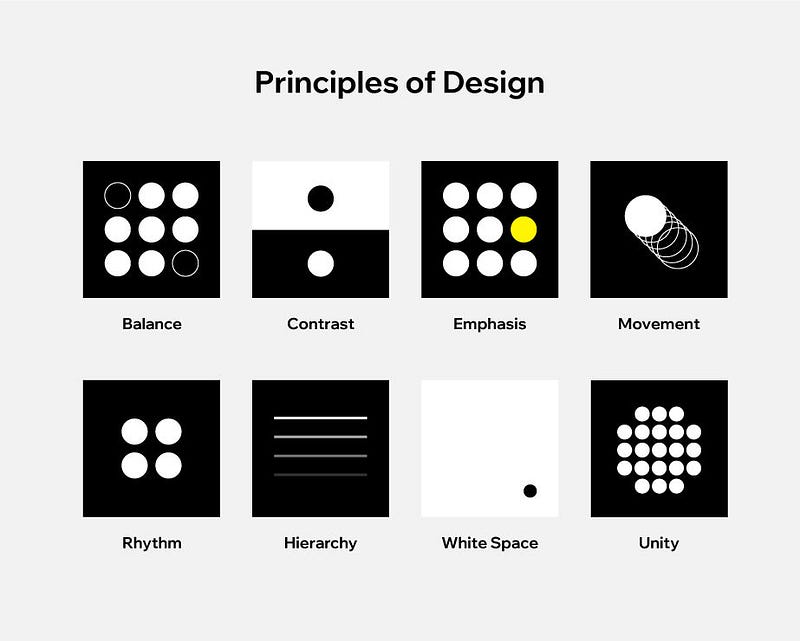
4. Keep in mind the design principle

Design principles are the key areas you must focus on to create exceptional user experiences. These principles are based on the idea that design should be aesthetically pleasing and functional.
The LMS system should allow users to focus on the content without being distracted by the design elements. This includes using a responsive design that adapts to different screen sizes and resolutions, ensuring that users can access the platform from any device and still have a seamless user experience.
Related post:

5. Don’t cut expenses when developing e-learning courses
One of the most common mistakes made when developing eLearning courses is cutting expenses. While organizations need to budget and keep costs low, making too many budget cuts can derail the entire project and often run into issues. Instead, when designing an LMS, focus on the fundamentals and prioritize your budget accordingly.

Investing in high-quality content and design will pay off in terms of learner engagement and course effectiveness. Thus, although there can be an additional cost initially, the long-term benefits and effectiveness of the LMS will help you get a better Return on Investment (ROI), making it the practical choice.
6. Make it easy to multi-task
People can perform multiple tasks simultaneously, so designing the eLearning platform with this in mind is essential. Make sure that when you design your eLearning content, it does not have a fixed pattern but allows users to explore multiple topics and take their own learning pathways.

The use of adaptive learning algorithms can help to personalize the learning experience for each user. This can improve the effectiveness of the course and thereby increase learner engagement.
7. Flexibility and customization are essential in eLearning UX design
Finally, ensure that your eLearning platform is designed by keeping flexibility and customization in mind. In today’s fast-paced and ever-evolving digital landscape, your LMS has to cater to learners’ diverse needs and preferences.

Flexibility in design means including responsive design elements, which provide seamless experiences on various devices, be it the laptop, computer, or mobile apps. This ensures that your content can easily be consumed on any device and remains engaging and attractive without distortions or errors.
Customization takes flexibility to the next level by tailoring learning experiences to individual needs.
For example, for learners with special needs, your written content should be made available in audio format so that the user does not feel stuck in any stage. This can also include adaptive learning paths, personalized recommendations, and content customization based on learners’ skill levels, interests, and learning styles.
Flexibility and customization in UI/UX design make learners feel more engaged and motivated to achieve their learning goals.


Conclusion
Designing an eLearning platform that provides a seamless user experience requires careful planning and execution. By following these seven tips, you can create an exceptional eLearning platform that engages learners and provides them with a personalized and practical learning experience.
Remember to keep the user’s needs and preferences in mind when designing the platform and use analytics to continually improve the user experience. With the right design and execution, an eLearning platform can transform how we teach and learn.
At Gyrus, we have designed an LMS system for dynamic learning needs. If you want to design an LMS specific to your unique needs, contact us today to schedule a free product demo and customize it to your specifications.

Did you enjoy this article? Let us know what you think in the comment section below!
Grab freebies from our website: Epicpxls, and sign up for our Weekly Newsletter to be updated on our weekly content!


