8 Ways To Improve Your UI Design
Little decisions can make a big difference.


Little decisions can make a big difference.
Knowing that, try using these 8 tips to enhance the quality of your UI design.

1. Use Better Spacing

Utilize space to create visual balance, make breathing rooms between the elements and divide content into groups.
2. Design For All States

Always create the design for all possible states. Don’t let the users guess if something is active, hovered, or disabled.
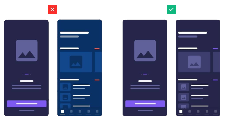
3. Provide a Visual Hierarchy

Use the power of contrast and color to navigate the users through your design. Emphasize the most important elements.
It is known that the human brain will perceive bigger elements as more important than the smaller ones. That’s why size has such an influence on visual hierarchy.

At first glance, it’s obvious that 2 bigger elements are more important than 4 smaller ones.
4. Check Color Contrast

Make sure your content is accessible and readable. Don’t put aesthetics before usability.

While the most obvious contrast is between black and white, this time we are going to use the 60/30/10 rule (a dominant color makes up 60%, a secondary color 30%, and an accent color 10% of the design) and warm/cold color contrast to create a harmonic layout and focus the user’s attention on the CTA button.

Color is one of the most impactful elements in visual design. Colors have their hierarchy which strongly influences the user’s perception.
5. Limit Yourself to 1 to 2 Fonts

Usage of fonts and their properties can make or break your design, so always dedicate enough time to the typography! Try limiting yourself to no more than 2 fonts. Instead, use different font weights to create contrast between the text.
It is recommended to use serif/sans-serif font contrast along with differences in weight, spacing, size, and color.
6. Use Consistent Icons

Icons should be simple and easy to understand. But also, they should be the same style, stroke width, and roundness.
7. Consistent Branding and Communication
Stay consistent with the overall brand. Imagine using one color palette and logo on one page and different ones on the other: chances are high you’re going to confuse the users and that’s the last thing you want to do.
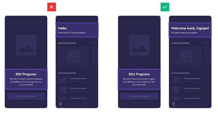
The language and copy you are using will influence how the user will perceive your product. Choose one voice and stick to it: it can be friendly, casual, or more corporate but it needs to be consistent.
8. Use a clear label for CTA button

Make your call-to-action labels easy to understand. Do not use complicated words and long phrases.

Did you enjoy this article? Let us know what you think in the comment section below!
More like this?
We know you need a part 2. Here are 8 More Ways To Improve Your Design.
 Crissa Aguilos
If you are searching for designs like fonts, icons, UI Kits, animations, graphics, illustrations, themes, photoshop add-ons, and templates, Epicpxls has a lot to share with you from free to premium design materials/resources.
Sign up for our Weekly Newsletter to be updated on our weekly blog and weekly surprises! You can also follow us on Facebook, Twitter, and Instagram.