5 Carousel Mistakes You Are Making
We see these design mistakes daily in the creative community. Read below and learn how to avoid them.

We see these design mistakes daily in the creative community. Read below and learn how to avoid them.

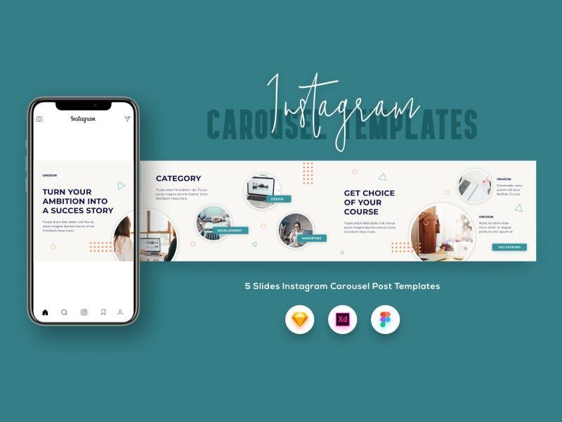
An Instagram carousel is a post with multiple photos or videos that can be viewed by swiping or clicking left. Up to 10 images or videos can be added and shared as a single post on the feed.
Carousel posts tend to have a higher engagement rate per post — between 1.65% and 5.13%, depending on the profile size. With one exception, carousel posts perform better than images or videos — an average of between 0.25% — 0.51% higher engagement.
“You no longer have to choose the single best photo or video from an experience you want to remember” — Instagram writes
To create a carousel post, press and hold the first photo or video you want to include in your carousel until the number 1 appears in the corner of the photo. If you’re using an Android, there will be a “Select Multiple” icon above your photo gallery.
Don’t forget to make sure that all the images or videos are of high quality. Use a minimum 1080 pixel width so they look great on any size screen. Don’t be afraid to use call-to-actions. Tell people to swipe through in your caption to keep them interacting with all of the images.
So, here are the common carousel design mistakes we often see:
Mistake 1: Alignment

“Let the design breathe.”
When a carousel is published, a small two-squares icon appears in the upper right corner that’s why you should avoid this corner. Also, avoid the edges, as well as the 50px on each side, unless you’re putting name tags/credits.
Mistake 2: Color + Contrast

Use good color combinations with good contrast for better readability for your audience. You can use sites like www.contrastchecker.com to check if how the colors work on screen and if there is a good contrast between the two colors or not.
Mistake 3: Glitch in Slides

We want our Instagram carousel to be “seamless”, right? Make sure the transition between your images and/or designs has a smooth transition before uploading them.
Mistake 4: Ugly Drop Shadows

On light backgrounds, we need to be careful with drop shadows. Decrease Opacity to make a natural shadow. Dark shadows look bad on light backgrounds.
Mistake 5: Wordiness

People think more sentences means more valuable post. It’s actually the opposite. Use the slides wisely in the carousel.
Have you done one of the mistakes above?
If your answer is yes, that’s fine. I understand that it’s kinda frustrating, and we can always learn to improve. Today, you learned that these are “mistakes”, and that’s why now you can already avoid them. Cheers!
… BUT HERE’S A LIFEHACK FOR YOU.
If you want an easy way (the wise way too), the best option would be using “ready-to-use templates”, instead of creating your design manually detail to detail. I found some cool ready-to-use templates on Epicpxls that would help you easily create professional-looking Instagram posts in under 10 minutes. (Yes, just that FAST!)
1. Courses Instagram Carousel Template

View or download it here:

2. Instagram Carousel Marketing Bundle

View or download it here:

3. Pastel Instagram Template

View or download it here:

4. Wedding Instagram Stories & Posts
By 3djagan

View or download it here:

5. Instagram puzzle feed template

View or download it here:

6. Medical Health Instagram Stories & Post Templates

View or download it here:

Are you looking for more designing and marketing ideas to engage your Instagram feed? Just visit Epicpxls (https://www.epicpxls.com/)and select from up to hundreds and thousands of choices for your project. You can also check out Epicpxls on Instagram, Facebook, and Twitter.
Don’t forget to 👏👏👏 and follow me if you enjoyed reading this story, and feel free to drop your thoughts down there in the comment section.


