10 Typography Terms Everyone Must Know
“Typography can make or break your message — it’s that important. Whether you’re a designer, writer, or marketer, understanding the basics…


Typography can make or break your message — it’s that important. Whether you’re a designer, writer, or marketer, understanding the basics of typography is essential.
That’s why we’ve compiled a list of 10 must-know terms that can help you craft more impactful and memorable content. Let’s get started!

Term 1: Stroke
Main marks or lines that make up the character. Characters can have low or high stroke contrast.
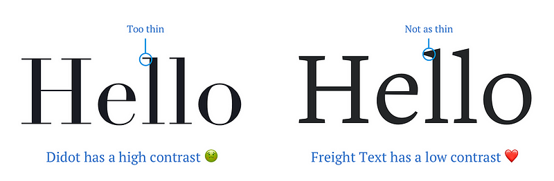
High stroke contrast
Common in transitional or didone serifs, and grotesque sans serifs. High-contrast fonts are more dramatic and rhythmic.
Low stroke contrast
Common in old style serifs and geometric sans serifs. Low-contrast fonts are simple and neat.
High stroke contrast typefaces don’t work well on small screen sizes, they’re better used for headings.
Term 2: Stress
The angle at which equal widths of a curved stroke sit.
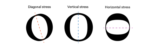
Diagonal — Common in old-style serif
Vertical — Common in static serifs and geometric sans-serifs
Horizontal — Seen in some display typefaces
Term 3: Ligature
One character that combines two or more characters with a single glyph.
Ligatures are common in decorative typefaces.

They’re created for situations where two glyphs don’t look good next to each other, so remember to check for them.
Term 4: Leading
Leading is the space between two baselines in a body of text. In typography, “leading” is pronounced to rhyme with “shedding” or “bedding”. The name comes from when typewriters were used (ancient times) and lines were separated by pieces of lead.

Increasing leading value gives more breathing room for the text and makes it look better and improves overall readability.
Term 5: Tracking
Tracking, also referred to as letter spacing, is the spaces between characters for an entire group of text. The amount of space between these characters is fixed.

The increase in tracking space decreases the density of the typeface and vice versa. Tracking has the ability to make the lengths of lines of text look more even.
Term 6: Kerning
Kerning is the spacing between only two characters (letters, numbers, punctuation, etc.).

Often, the default setting for kerning in graphic design software works well, but there are some instances in which the text needs to be spaced apart further for proper readability. There is no “magic” amount of space to place between each letter — kerning is not mathematical, it’s all about perception.

Term 7: Rags
Rags are uneven margins in vertical columns of text most often seen on the right side of a column when the text is left-aligned.

Term 8: Widow
A widow is a short line or a word that appears at the bottom of a paragraph, column, or page.
It is considered poor typography because it leaves too much white space between paragraphs and tends to draw the eye toward the hanging word. It interrupts the reader’s flow, diminishing readability, and gives an unintended visual emphasis on this dangling word.

The rule of thumb is at least two words, three if the words are short, on the last line of a paragraph.
Term 9: Orphan
An orphan is a similar unwanted straggler, but this describes words that appear at the top of a page.
Orphans really belong on the previous page, as not only do they look untidy on the page they appear, but they also break the flow of reading across two pages.

Term 10: Typography Classifications
With thousands of font types to choose from, it’s helpful to pick out the common characteristics amongst each one and categorize them.

Serif typefaces
Serif typefaces have embellishments that project from the end of each stroke of a character
Sans serif typefaces
Sans derives from French and translates to “without”. Sans serif characters are those without any embellishments at the end of their strokes.
Script typefaces
These typefaces and fonts resemble hand lettering styles ranging from casual cursive to elegant calligraphy.
Decorative
These typefaces, also called display typefaces, are intended for exactly that: display. Their unconventional and unrestrained looks call for their use in headers, not body text.

Bonus Terms: Font file formats
A font format is a specific file type designated to hold font data.
True Type (TTF)
More limited format able to hold up to 256 characters
Open Type (OTF)
More robust format supporting expanded character sets, ligatures, alternate styles, and more…
Web Open Font Format (WOFF)
Format used in web pages that supports font distribution from the server to the client.
If you have the ability to choose, it’s best to go with OTF format when installing fonts or design. It has better cross-platform support and has an ability to add a digital signature to a font set to ensure the integrity of the files.
Did you enjoy this article? Let us know what you think in the comment section below!
Grab freebies from our website: Epicpxls, and sign up for our Weekly Newsletter to be updated on our weekly content!